5th. PI League Scores and Comments
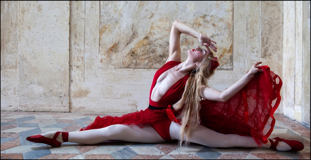
01 Dancer in Red ...The Finale by James McCraken
For “Full Screen View” and File information, Click on any Image
Here is a summary of placed images:

Here are the full results, with Scores and our judge’s comments
| Judging order and Title | Group | Score | Rank within Group | Place within Group | Author | Comments |
| 01 Dancer in Red ..The Finale | A | 20 | 1 | 1= | James McCraken | Very powerful image, good colour palette and use of letterbox format, sharp with good detail on the hair and clothing. Just a touch bright in the centre of her chest. |
| 02 Clematis | B | 18 | 2 | 2nd = | Richard Anthony | Fills the frame well, great colour saturation without losing detail on the petals and the centre is pin sharp. The fence is nicely thrown out of focus and I like the inclusion of the bud. |
| 03 Ferrari 599 in Modena yellow | A | 17 | 6 | Ully Jorimann | Again good colour saturation and a nicely abstracted section of the car. I would have liked to have seen more made of the diagonal from top left to bottom right by actually anchoring it into the corners, so cropping a little off the right hand side and the top. | |
| 04 Light on the woodland floor | B | 16 | 8 | Peter Cotton | Well spotted and singled out, good composition. I feel the dark areas need to be brightened up a fraction but keeping a dark vignette. As the ground colour is very murky it might work better in black and white with subtle use of HDR to pick out the details. | |
| 05 Medium decorative dahlia | B | 17 | 5 | Brian Howard | Good saturation, pretty sharp, completely filling the frame, like the square format it suits Dhalias and darkening the corners works too. | |
| 06 Old wood and iron | B | 17 | 5 | Philip Byford | I might have squared this image off personally to make more of the wood grain and make the iron features slightly larger in the frame. Don’t need the window frame or much below the lock plate. The focus is good and I like the light on the twisted door handle. | |
| 07 On the ropes in my CKs | A | 18 | 2 | 3= | John Marshall | Lovely and sharp but the lighting and background are a bit on the bland side. Maybe if this was rendered black and white it might be a little more exciting. I want to see more muscle definition and rope detail because the shape she is creating is great. |
| 08 The shoe repairer | C | 17 | 4 | 2nd= | Linda van Geene | All the makings of a lovely environmental portrait with this chap speedily working away and surrounded by shoes, the composition is great, especially the gap you have placed his head in. Sadly not a fast enough shutter speed to capture his fast moving hands and just a fraction overexposed which could easily be fixed in post. |
| 09 Votive candles | B | 16 | 8 | Brian Young | I think you have tried to capture too much in this image. For me the interesting part is the dripping wax on the left, the wax on the right looks pretty yucky. I think if you could have gone in a little closer and found a good composition (the first 3 or 4 votives) and maybe got down to their level a touch more, this might have been a stronger image. The colours work well | |
| 10 Poppies after Monet | C | 18 | 2 | 1st | Mike Mitchell | Quite an effective use of this painterly filter used to make the image look like a painting. If this was printed on a textured matt paper it could look very convincing and I’m sure would have some commercial value. I like the composition and square format and colours are lovely. |
| 11 Shugborough Folly | A | 17 | 6 | Graham Hutchinson | It’s difficult to get a creative shot of old ruins and this is a little bit central in the frame. The lighting is good and you’ve chosen your viewpoint well, making much of the encroaching foliage. The light on the (fireplace) wall and what remains of the statue is very good. Lovely and sharp and makes me want to see what it used to be like. | |
| 12 Greater Knapweed | A | 18 | 2 | 3= | John Humphrey | I really like the use of the white background and square format here which offsets the shape and colour of this attractive flower. It’s pretty sharp but could do with a touch more lighting in the centre to bring out the detail. |
| 13 Last night before the curfew | A | 18 | 2 | 3= | James McCraken | A lovely peaceful and serene scene with great evening light on the rolling hills. The farmhouse is very well placed on the right hand third and the letterbox format suits the landscape perfectly. The sky is interesting too especially on the right hand side and could be darkened down a fraction on the left as it’s just starting to burn out in places. |
| 14 Alan and Bonzo | A | 20 | 1 | 1= | Rob Harley | This is a charming portrait of these two characters, the look on Bonzo’s face is priceless. The lighting is well handled with good fur detail, tricky on a black dog and Alan has good lighting on his face. The image is pin sharp and I really like the clear seam details on Alan’s denim jacket. Great composition too. |
| 15 Cooling Sails | A | 18 | 2 | 3= | Ully Jorimann | Very striking abstracted image which is perfectly sharp and great use of complimentary colours. Composition wise I feel the pole is fractionally too central and would have off set it slightly by cropping a little off the right hand side. A couple of anchor points where the diagonal exactly hits the corners would help. |
| 16 Tadpoles feeding on a snail | B | 17 | 5 | Peter Cotton | Very well spotted and good careful composition, the square format works well. Glad I have the title I was struggling to work out what exactly they were nibbling on. You’ve gone in very close (possibly using a macro lens) as these guys are pretty small but they are still mostly sharp. Just a few overexposed highlights which if brought down in post would make a big improvement. | |
| 17 Roseanne | B | 18 | 2 | 2nd= | Brian Howard | A lovely portrait of this very attractive young woman and I think the black and white conversion works well. The composition is good with the tilt of her head creating a strong diagonal, however I’m finding the entire image a little soft focus and if nothing else is in focus the eyes absolutely should be, here the eye furthest away appears slightly sharper and it would have been nice to have more detail in her hair. |
| 18 Babbling brook | B | 16 | 8 | Philip Byford | The light on the tops of the undulating waves are the strongest part of this abstracted image for me but take a while to spot in amongst the murky colours. It might be easier to make more of them if this was rendered black and white too. Not as strong as some of the other images in this competition but worth playing with, maybe a square crop too would be beneficial, try taking off the right hand side as this is weaker than the left. | |
| 19 Boudoir | A | 17 | 6 | John Marshall | I always think that nudes look more classy in black and white, the skin tones here are a little pink. The lighting is a bit flat which means we are losing the natural shape and form of her back and shoulders and the wall on the right hand side is overexposed and blown out . Think about the pose you place your model in, heels (especially grubby ones) and the soles of feet are not terribly attractive and her face is in shadow. She’s also a little central in the frame. It is sharp however and there is good detail in her hair. | |
| 20 Gotcha | B | 15 | 10 | Brian Young | Interesting title, I’m guessing the street cleaner has been struggling for some time to pick up some litter, although this is not immediately apparent. The lighting is a bit flat as we are having to contend with a fairly dull day and the background street scene is way too sharp, I would have preferred a short depth of field used here to blur out the distractions. | |
| 21 Sightseeing in the rain | C | 16 | 5 | Linda van Geene | This looks like the sort of place you don’t expect to find rain and I’m sure it was pretty cold too, it looks breezy. The image itself is slightly lacking in quality and I think possibly because it is too contrasty. The blacks certainly have become very blocky with no discernible detail. The composition though is good and I’m pleased the two figures in the foreground are just left of centre. | |
| 22 Still life with gourds | C | 17 | 4 | 2nd= | Mike Mitchell | Still life is not as easy as you might think and one of the main components is good lighting to create atmosphere. The composition here is good although I feel the bouquet is slightly on the twist away from us and would have preferred the yellow rose and grapes beneath more central in the display. The position of the display in the frame however is good, just slightly right of centre, allowing for the two gourds to fill the space on the left and balance out the image. The colours are a little on the bright side, personally I would have preferred them slightly desaturated with more subtle side lighting. |
| 23 Spanish Gunsights | A | 16 | 11 | Graham Hutchinson | A difficult image to take from your location on the water, the image seems more about the cave than the gun sites as this is what you see first and is by far the most dominating part of the image. If you had letter boxed the image this would have helped strengthen your subject as the sky is very bright and distracting. You could also take off a slice of the right hand side which also doesn’t add anything to the subject. The texture on the rock face and in the caves and the colour of the water is very good. | |
| 24 Jewish memorial and railway jetty Almeria | C | 17 | 4 | 2nd= | Emyr Williams | Another picture I think would be stronger in black and white with this contrasting light, heavy shadows against a pale concrete area and stone lighting on the metal structures and base supports of the jetty. You could easily create an anchor point at the bottom left by cropping off a slither to the shadow of an unseen post. The small white square top right makes an interesting corner. |
| 25 Tulip | A | 18 | 2 | 3= | John Humphrey | Another very creative and painterly image which is all about shape and colour. I’m really enjoying the suggestion of the shape of the flower and its stem and the twisting petals suggest movement which is lovely. The background supporting colour works very well against the soft pinks too. I just find the whole image fractionally too grainy. Having said that as with the poppies, I can imagine if this was printed on a textured matt paper it would have some commercial value. |
| 26 Weathering study | C | 15 | 6 | Emyr Williams | I’m not quite sure if this is taken from one scene or whether it is a combination of images. The white vertical lines are throwing me a bit as is the plain blue strip on the left. The coloured wood and the peeling paint are both great finds as the colours are terrific but sadly neither image is sharp enough and both seem slightly over exposed. | |
| 27 Aquiligia | B | 20 | 1 | 1st | Richard Anthony | I really like this study of this beautiful flower head. The lighting is superb with plenty of detail on the petals and in the centre which is also pin sharp. The inclusion of the dark green leaves behind and the soft focus bud in the fore keep it real without it looking too staged. The black background works a treat really offsetting the cream flower head. |
| 28 Remembering | A | 18 | 2 | 3= | Rob Harley | When I first saw this image I didn’t see the young woman on the rocks and I wasn’t sure what the title meant, then I spotted her and she is actually very important to give us a sense of scale as well as meaning. We are fractionally too contrasty which is probably why I didn’t spot her at first as she is quite shaded but some of the rock faces are going overblown and starting to loose detail. Great composition though. The water is well rendered. |